Industry
CRE Tech
Product
GatherGov

Everyday, 100,000+ hours of government meetings happen throughout the US.
Topics like approving real estate projects, rezoning a residential land to industrial etc are regularly discussed. Additionally, local government policies for public wellness is also discussed.
Real estate companies have a human representative attend any meetings they deem relevant/important to their projects. This person manually takes notes.
Because of manpower constraints these companies only attend 15% of these meetings, and regularly miss important discussions that happen.
85% of these meetings are regularly uploaded on the internet, either to custom government portals or to public sources like YouTube, Vimeo etc.
GatherGov downloads all of these meetings, transcribes them, identifies discussions related to real estate and creates custom reports for (Commercial Real Estate) CRE companies.
Through this, CRE teams can identify a rezoning or policy decision before it’s made, monitor similar real estate projects and identify government and community sentiment towards it etc.
This effectively saves a mid sized CRE company at least $100M a year.

There are 2 teams that finance a real estate project. Entitlements team and deployments team.
This team “entitles” a project before money is deployed.
For example, let’s say a CRE company wants to build a mall in a city. This is what the entitlements team will do:
Figure out which land parcels are options for this land and find out their current zoning (residential, commercial, agricultural, industrial etc.).
Let’s say they shortlist 2-3 land parcels which are zoned for residential and agricultural. Since a mall is a commercial property, they want to see if the local government would approve rezoning from agricultural/residential to commercial.
For this, they monitor local government meetings in those particular localities to understand what the government and community sentiment is for rezoning. They want answers to:
Will there be community pushback?
Will the local government approve it?
Which stakeholder inside the local government would lean towards approving?
Was there a similar project that happened in this locality? If yes, how long did it take to approve that project?
If the answer for these is positive, then the entitlements team with give a thumbs up to the deployment team to take a bank loan, acquire the land and apply for building approval.
I went through a few user interviews, our customer also forwarded us their strategy and what they really want to know from tracking projects in a municipality.
When working in municipalities they already understand
They want a quick, high-level scan of projects before deciding which ones deserve deeper review.
Key details like project name, asset class, approvals sought, and filed date help them assess relevance instantly.
Only if a project looks important do they dive into its full history and meeting-by-meeting progression.
When working in unfamiliar municipalities
They open every project to understand how it has progressed and whether it’s relevant to their interests.
They take notes, evaluate government and community sentiment, and learn the jurisdiction’s behavior through existing cases.
They look for patterns across similar projects
They compare the approval timelines of related projects to understand how long entitlements typically take for the same asset class.
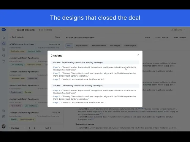
They need clarity between facts and AI inference
They want a clear separation between verified data and AI-generated insights.
For any AI inference, they expect proof—citations from meeting audio, video, minutes, or patterns from similar projects.
Over time, as trust builds, citations may become less critical.
Time is money — literally
They often take loans to acquire land and build infrastructure, which creates significant carry costs (interest on borrowed capital).
Longer entitlement or construction timelines mean higher costs, sometimes reaching tens of millions.
Even a one-month reduction in timeline for a single project would justify their investment in GatherGov.
When they explore a project in depth
They want to see every meeting where the project was discussed, along with clear outcomes and decisions from each one.
They need ways to revisit and share key projects
They want to save, bookmark, and share projects that matter to their team.
They also need PDF exports for internal discussions—many reviews happen in physical conference rooms where printed packets are still the norm.
They want to stay updated on active or relevant projects
For projects they care about, they want to monitor upcoming meetings and know the agendas ahead of time.
They also want weekly alerts or reports about major events—new filings, ordinance approvals, or other meaningful shifts.
GatherGov had a screen called “Reports”, all the different types of reports like rezoning, projects, bonds etc., were presented in a tabular format with each row being a meeting. When the row is expanded, users will be able to see what exactly was discussed, along with the citations. Now, for an enterprise customer whose sole purpose of using GatherGov was to track different projects, what specific to the projects were discussed on the meetings, what was the sentiment, timeline etc, the expanded row started to get very busy. Upon doing some competitor research I understood that Project Tracking is a much deeper use case and products exist to solely serve that purpose, and that it wouldn’t fit our generic “Reports” layout. Project tracking had other unique requirements like looking at the project timeline, nesting multiple meetings under a single project etc.

I realized that the depth and complexity of the requirements couldn’t be supported by a simple expanding-row table. The existing Reports screen introduced several limitations:
The table could comfortably display only 5–6 columns, while the project use case required 11+ key data points, which would force a horizontal scroll and make scanning difficult.
Each row represented a project, but projects contain multiple sections of analysis, numerous meetings, citations, and related project links—far too much information to fit into a small expanded row.
Users needed to download a project as a PDF and have the layout closely mirror what they see on screen, which isn’t achievable with an expanding table format.
They also wanted to share a project easily, which becomes awkward when the project lives inside a collapsible row.
The lack of isolation created text overload, since expanded content competed visually with other rows still visible in the table.
Most importantly, placing project tracking inside the Reports section made it feel like “just another report,” diminishing the importance and depth of this workflow.
Because of these, it made sense to bring Project Tracking out of the reports and position that as a separate feature.
Even though our customer was content with the table view, I needed to give them a much better user experience to seal the deal.
Final solution
Since the prospect was evaluating us directly against a competitor for UX, we went all in and delivered the solution options in 2 days. This is a walkthrough of the final design that became the selling point for the ~$500k deal.

We proposed two split views, one that had very few project data points and one that had it all. The tradeoff was the dedicated space on the right side for the project deep-dive. I thought the rejected option below would let them skim through the projects faster and decide which ones they wanted to dive deeper into. But they were okay with having only a few details but have more space dedicated to the project deep-dive.